Elexon
Designing a public-facing dashboard that transforms complex data into simple and clear information, helping people build greener energy habits with confidence.

CLIENT:
Softwire
(For Elexon)
TEAM:
1 x Design Principle
1 x Developer Lead
2 x UX Designers (me)
5 x Developers
TIME:
12 Weeks
MY ROLE:
UX Research, Ideation, Product Strategy, Workshop Facilitation, Usability Testing & Iteration, UI, Wireframing & Prototyping, Accessibility Advocacy, Cross-Functional Collaboration
The Challenge
Elexon wants to help the UK move closer to Net Zero by making complex energy data accessible to the public and have tasked our team to deliver a proof of concept.
The challenge was to translate technical, industry-facing information into a simple, engaging dashboard that empowers everyday users to make greener choices, without compromising data integrity or Elexon’s neutrality.
Project Outcomes
📌
Users found the dashboard clear and actionable. Even without prior knowledge, people could understand energy data and identify when to use appliances for greener/cheaper times.
📌
The Proof Of Concept showed that Elexon can successfully adapt its industry-facing data for a consumer-facing energy dashboard, opening the door to broader public engagement and new marketing opportunities.
⚡
Create opportunities for visibility and publicity
🚫
Maintaining Elexon’s neutrality.
The design had to encourage action without persuading or taking a stance, remaining neutral while still motivating change.
📌
Built on strong research and strategic thinking, the project set the foundation for future mobile-first experiences and a fully developed consumer zone on the platform.
Business Needs…
⚡
Empower people to make greener energy decisions
…And Constraints
🚫
Embedding within Elexon’s industry-focused site.
This meant keeping everything to a single page. Thus limiting content and a risk that everyday users would get lost.
⚡
Align with Elexon’s own sustainability goals
From our earliest conversations with Elexon’s stakeholders (product, strategy and marketing teams), it became clear that the dashboard needed to do far more than simply reach the elusive everyday person:
🚫
Constraints of a desktop-only design.
Research showed that everyday users typically check this information on their phones, making a desktop-only experience harder to reach them.
⚡
Showcase Elexon’s contribution to Net Zero
We also uncovered a set of constraints shaping what was possible. These boundaries became just as important as the needs they sat alongside.
🚫
Protecting Elexon’s data integrity.
We needed to simplify complex data for users without distorting it or misleading users.
“We’ve been really pleased with the quality of the content, backed by solid research.
We cannot wait to put these ideas into production”
- Stakeholder
💡 Elexon's world is technical, data-heavy, industry-facing, but we were designing for the everyday user, who prioritises their time elsewhere. How can we bring these two worlds together?
My Role:
Working In Agile
Collaborating as a Cross-Functional Team
I worked as one of two designers in a highly collaborative team alongside five developers. We kept communication open through regular check-ins, shared progress often and held joint ideation sessions where developers contributed equally (often catching technical risks early and helping us move faster with more confidence).
Research Responsibilities
My co-designer and I shared responsibilities across the project. We divided industry research and aligned our findings, I wrote the user questionnaire and interview guide, and we split interviews (I led four and took notes on four). I facilitated the design workshops for the full team and led two stakeholder interviews.
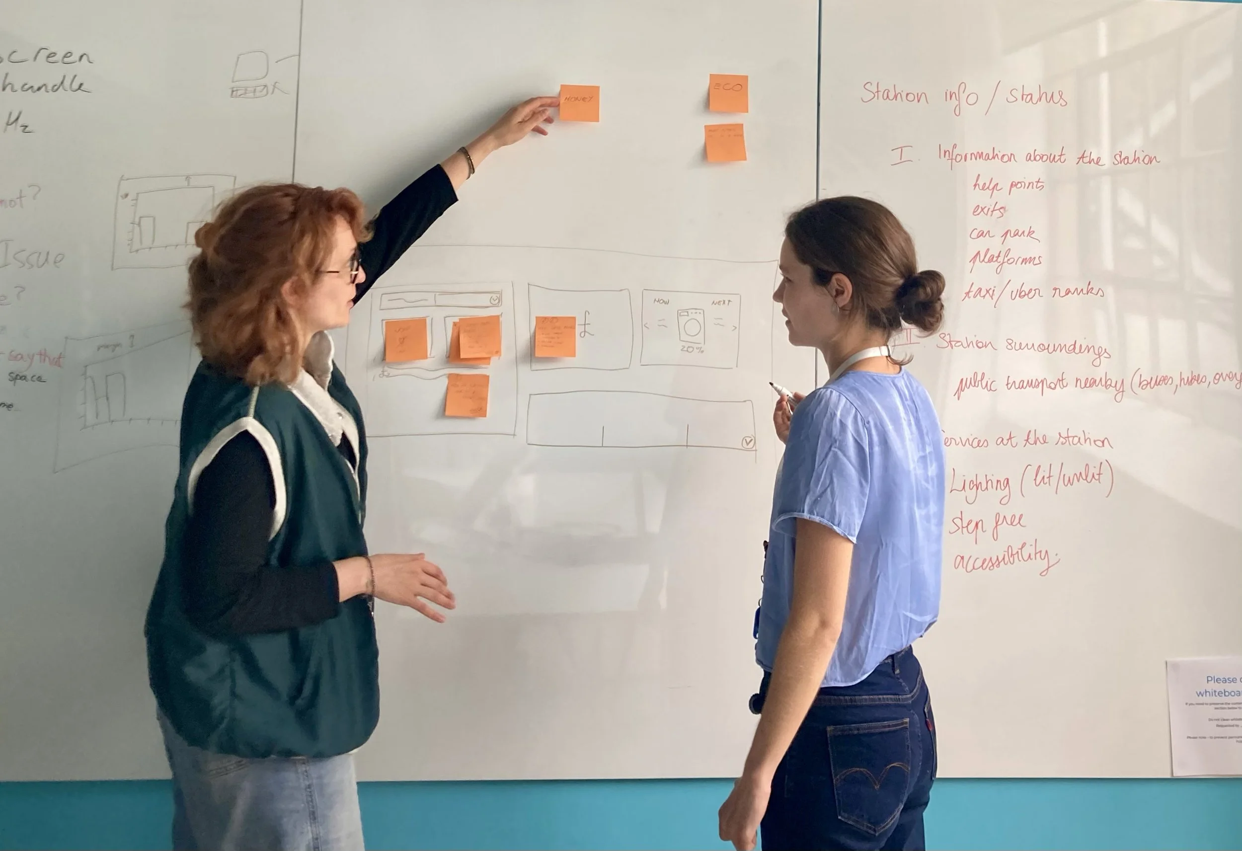
Workshop Facilitation
I facilitated design workshops with the full team, guiding discussions, aligning decisions and making sure insights were captured and acted on.
Design Direction
In the design phase, we aligned on direction, sketched ideas individually, then voted on which ideas to take forward. I took the lead on wireframes, while my co-designer handled prototyping.
Problem-Solving & Iteration
When initial testing revealed confusion around the flow, I proposed a hands-on method (borrowed from my choreography work), printing and rearranging UI components like puzzle pieces to quickly visualise the user journey. This exercise allowed my co-designer and me to step into the users’ perspective and helped us create a clearer, more layered user flow.
Championing Accessibility
With a strong personal interest in inclusive design, I advocated for accessibility checks. I tested the designs with a colour-blindness simulator, highlighted areas where visual cues needed strengthening and pushed for a data table that would be readable by screen readers.
Stakeholders responded positively and expressed interest in reviewing accessibility across their wider product.
Keeping the Bigger Picture in Focus
Throughout the project, I focused on connecting user insight, business goals and technical feasibility. My ability to zoom out and keep the bigger picture in view ensured the solution remained intuitive, credible, and aligned with Elexon’s needs.
Full Design Walkthrough
*Keep your sound on!