Elexon
Designing a public-facing dashboard that transforms complex data into simple and clear information, helping people build greener energy habits with confidence.

CLIENT:
Softwire (For Elexon)
TEAM:
2 x UX Designers (me)
5 x Developers
1 x Design Principle
1 x Developer Lead
TIMEFRAME:
12 Weeks
MY ROLE:
UX Research | Product Design | Ideation | Usability Testing | Wireframing | Workshop Facilitation
Project Summary
SOLUTION
Clear, guided experience instead of a traditional dashboard.
Behaviour motivating features, such as regional comparisons and actionable tips
PROJECT GOALS
Make complex energy data easy to understand.
Support greener day-to-day decisions.
Bridge business needs with everyday user needs.
OUTCOMES
Elexon gained confidence that a public-facing dashboard brings value.
Users understood energy data without prior knowledge.
Laid the foundation for mobile-first approach.
“We’ve been really pleased with the quality of the content, backed by solid research. We cannot wait to put these ideas into production”
- Elexon Stakeholder
View Final Design Walkthrough
*Keep your sound on!
THE FULL STORY
Context
Elexon wants to help the UK move closer to Net Zero by making complex energy data accessible to the public.
The challenge was to translate technical, industry-facing information into a simple, engaging dashboard that empowers everyday users to make greener choices, without compromising data integrity or Elexon’s neutrality.
Business Constraints
🚫
Embedding within Elexon’s industry-focused site.
This meant limiting content to one page and a risk that everyday users would get lost.
🚫
Constraints of a desktop-only design.
Research showed everyday users expect this information on mobile, potentially limiting the reach of a desktop-only experience.
🚫
Protecting Elexon’s data integrity & neutrality.
Simplify complex data for users in a neutral, actionable way that motivates change without misleading.
My Role: Working In Agile
Collaborating as a Cross-Functional Team
I worked as one of two designers in a highly collaborative team alongside five developers. We kept communication open through regular check-ins, shared progress often and held joint ideation sessions where developers contributed equally (often catching technical risks early and helping us move faster with more confidence). *This collaborative work directly contributed to the project success
Research Responsibilities
My co-designer and I shared responsibilities across the project. We divided industry research and aligned our findings, I wrote the user questionnaire and interview guide, and we split interviews (I led four and took notes on four). I facilitated the design workshops for the full team and led two stakeholder interviews.
Workshop Facilitation
I facilitated design workshops with the full team, guiding discussions, aligning decisions and making sure insights were captured and acted on.
Design Direction
In the design phase, we aligned on direction, sketched ideas individually, then voted on which ideas to take forward. I took the lead on wireframes, while my co-designer handled prototyping.
Problem-Solving & Iteration
When initial testing revealed confusion around the flow, I proposed a hands-on method (borrowed from my choreography work), printing and rearranging UI components like puzzle pieces to quickly visualise the user journey. This exercise allowed my co-designer and me to step into the users’ perspective and helped us create a clearer, more layered user flow.
Championing Accessibility
With a strong personal interest in inclusive design, I advocated for accessibility checks. I tested the designs with a colour-blindness simulator, highlighted areas where visual cues needed strengthening and pushed for a data table that would be readable by screen readers.
Stakeholders responded positively and expressed interest in reviewing accessibility across their wider product.
Keeping the Bigger Picture in Focus
Throughout the project, I focused on connecting user insight, business goals and technical feasibility. My ability to zoom out and keep the bigger picture in view ensured the solution remained intuitive, credible, and aligned with Elexon’s needs.
Researching the Landscape
The energy market is incredibly complex, so fully understanding the broader context and where Elexon sits, was vital if we were to deliver a dashboard that meets user needs and fulfils Elexon’s expectations.
Alongside this, competitor analysis showed that existing dashboards were inaccessible for non-experts, leaving everyday users overwhelmed.
💡 After a week of in-depth desk research, I still couldn’t clearly articulate what gCO₂eq/kWh actually meant.
If I still struggled to make sense of it, how could everyday users?
⛔
Complex data with too much detail that is irrelevant and overwhelming for the everyday person.
⛔
Full of jargon that is unfamiliar to the everyday person, alienating them
⛔
Data is visualised in an unfamiliar way (charts), so that processing the information is hard for the everyday person.
⛔
Lack of context leaves users stranded and asking what to do next. *write this better
💡 This was Elexon’s chance to stand out by being the one energy platform that actually speaks the user’s language and makes this complex data meaningful and relatable to users. friendly, clear and easy to digest
USER RESEARCH
Understanding Our Target User
⏱️
"I try to reduce my energy usage when I have the headspace for it"
57% of respondents
At this point, though, we were still working from assumptions. We needed to meet users where they are if this dashboard is to be of any value.
So we conducted a survey with 70 participants and interviewed 8. The goal was to understand daily routines, mental load and triggers for behaviour change.
We asked open-ended questions not just about energy, but about how people absorb new information or stick to habits (e.g., starting a gym routine, learning a recipe). This gave us insight into how a dashboard could realistically fit into people’s lives.
🌳
"I don't know when the greener times are"
63% of respondents
This research revealed that people’s motivations for action were almost evenly split between saving money (46%) and helping the environment (48%), so we developed two personas to guide our design. And while the entry point differs for each persona, several common needs emerged:
🔎
Clarity at a glance
Information must be understandable without effort.
🔎
Actionability
Users wanted to be told what to do, not left to interpret graphs
🔎
Personal relevance
Progress tracking and comparisons increased motivation.
🔎
Convenience
Behaviour change had to fit seamlessly into existing routines.
Framing The Problem: How Research Influenced Our Design Direction
We decided against an industry-style dashboard and instead created a guided, step-by-step experience to gradually build knowledge.
We prioritised plain language over technical accuracy, knowing our users had limited prior knowledge.
We included actionable tips (e.g., “best times to plug in”), because research showed users struggled to translate raw data into decisions.
We considered progress tracking and comparisons as motivational features for future iterations.
Our user research showed a gap between what people care about (saving money, helping the environment) and what they actually know or have capacity for (limited knowledge about energy and emissions, only thinking about energy when they “have headspace”).
This insight reframed the challenge: instead of simply visualising data, our job was to translate complexity into simple, timely actions that could fit seamlessly into everyday life.
Research showed most users didn’t know when greener times were.
Research showed “money-savers” and “eco-motivated” users needed different hooks.
Research showed behaviour change happens only when mental load is low.
→
→
→
The team prioritised showing the best times to use appliances in plain language.
We designed for both financial savings and carbon savings.
We focused on glanceable, lightweight interactions over complex deep dives.
Collaborative Design in Action
With our research insights and problem space defined, we established a design direction that strikes a balance between simplicity and motivation (for the user) and credibility (Elexon’s reputation).
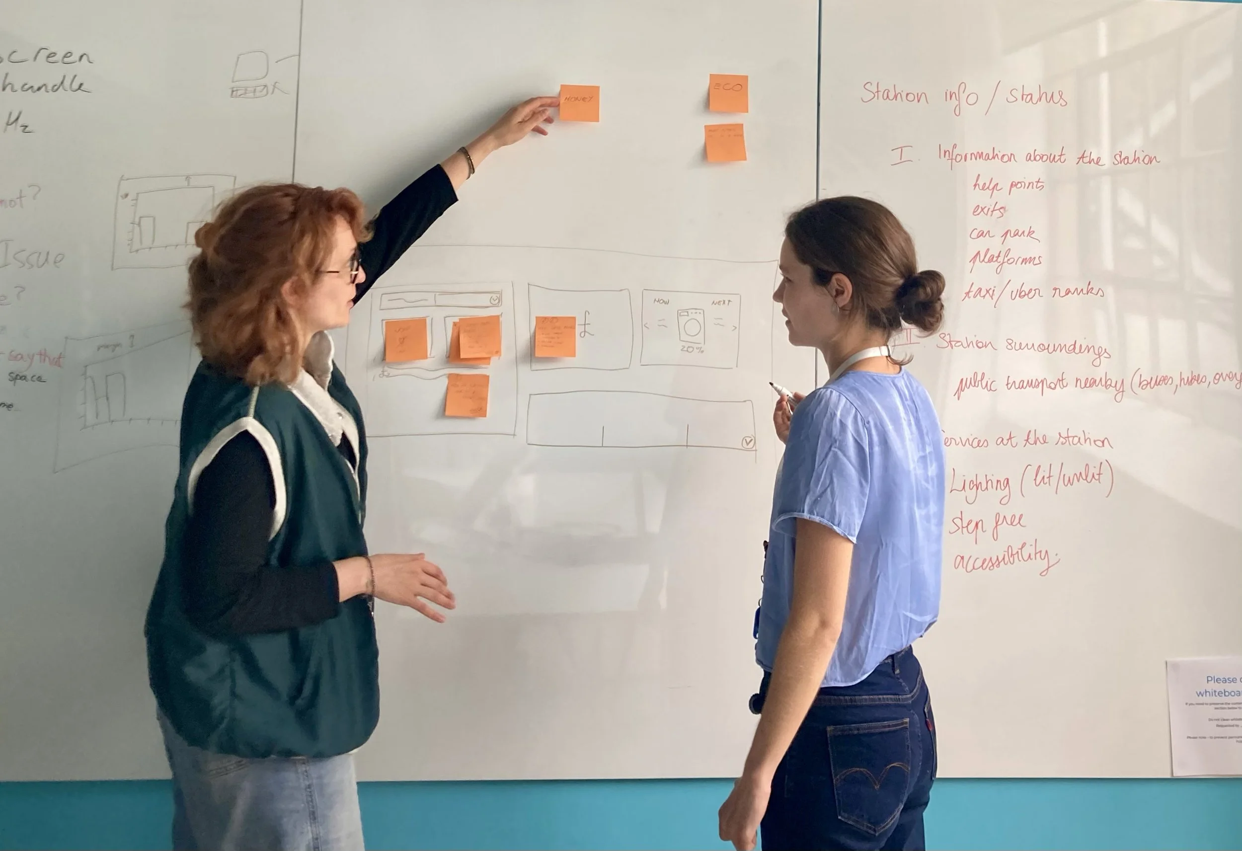
A design session, together with developers, at this point was a chance to bring fresh perspectives to the table, validate our ideas and explore new directions together. This also ensured we aligned on what’s technically feasible.
Their continued input throughout the project helped us refine ideas, avoid potential implementation hurdles and ensure our design decisions could translate smoothly into a working product.
Reducing Complexity and Encouraging Action
!!! Include user quote
User research highlighted that most people didn’t know when greener times were, and didn’t want to wade through technical data. That insight directly shaped our decision to:
Prioritise clear, actionable tips (“Best time to run your washing machine: 3–5pm today”).
Motivation over obligation: tone and visuals should make greener choices feel rewarding, not like homework.
Replace jargon (e.g., “carbon intensity”) with plain language and supporting visuals.
Comparisons (e.g., against an average household).
Create layered information: glanceable summaries first, with deeper insights only if users chose to dig in.
Friendly, encouraging language throughout to nudge without guilt.
DESIGN CHALLENGES & DECISIONS
Usability Testing
Fill in this section explaining the focus of the test session and what the overall learning was.
A lot of it was about small changes, not a big flashy design. People wanted more handholding, and we realised that in trying to remove the complexity we removed too much. So a lot of iterations were about bringing the context back, prioritising information and adjusting the langauage.
Cognitive Load Is Too High
"I am having to think hard about this and work it out for myself" - Participant 3
BEFORE
Testing revealed confusion with the appliance cards - users struggled to grasp the context at first glance, and some found the bottom navigation unexpected.

AFTER
• Added additional text to improve clarity and reduce frustration.
• Introduced a ‘see our workings’ dropdown to build credibility and trust.
• Internal A/B testing confirmed that our changes improved clarity.

Regional vs. National Data - explain more
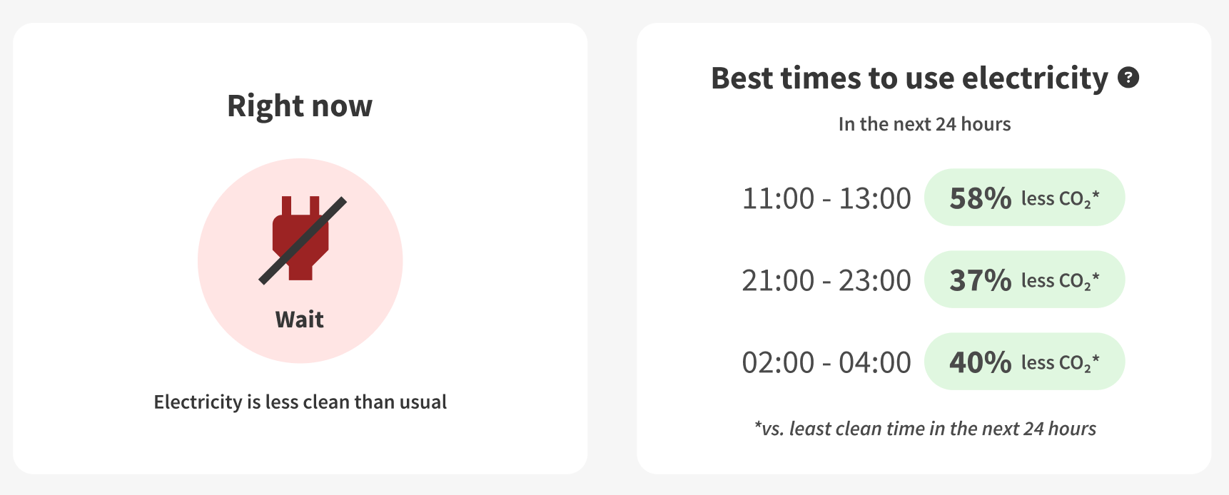
We wanted to provide relevant and actionable data. We knew from our research that people wanted relevant information. We planned a feature that compared carbon intensity to the national average - showing “wait” if CI are higher than average and “plug in” if lower.
However, carbon intensity varies by region. A national average risked showing constant “wait” for those in South Wales or “plug in” in North Scotland, leaving users powerless and disengaged.

We decided to calculate individual CI averages for each region.
• We shifted focus from absolute green zones to relative progress - being better than before.
• We rephrased “Emissions are high” to “Electricity is dirtier than usual” to show that information is relative.
BEFORE
*include source here

AFTER
Not enough context left testers confused
Not enough context left testers confused. We created "simple" sections that are easy to glance, but testing revealed it lacked sufficient context and explanation.
"I am a little confused" - Participant 2
"Am I looking at personal smart meter information?" - Participant 5
"I didn't know electricity could be cleaner at different times" - Participant 2
To solve this, we added more detail with a clear narrative, guiding the user through the page.
BEFORE

AFTER

Testers found the language too technical
We overlooked that our personal knowledge grew during the project, and the terminology that made sense to us was too technical for the users.
"I am not really sure what 'grid' means" - Participant 2
"Emissions are high... is that to do with my car?" - Participant 3
"Carbon intensity forecast... what does that mean?" - Participant 1

Tone of language - finding the right balance between familiar and approachable language
Finding the right balance between familiar and approachable language
We initially used “dirty and clean windows” as it felt more user-friendly than high and low carbon intensity. However, research showed people adjust energy use only when they have the headspace, typically using energy when it suits them.
To avoid creating guilt and discouraging return visits, we switched to “less clean” language.

Outcomes & Next Steps
Outcomes:
!!! Talk about potential impact, since I dont have outcomes available. Refer to usability testing results - what did testers feel overall. Show future metrics that could be used.
Next steps:
Explore mobile-first delivery (widgets, notifications, subscriptions). !!! Include mockup here
Focus on visibility to ensure adoption.
Continue iteration with real-world usage data.
[Prompt: What would you measure as success metrics if this went live? Engagement? Behaviour change? Elexon brand visibility?]
Reflections
!!!More thought needed here