Elexon
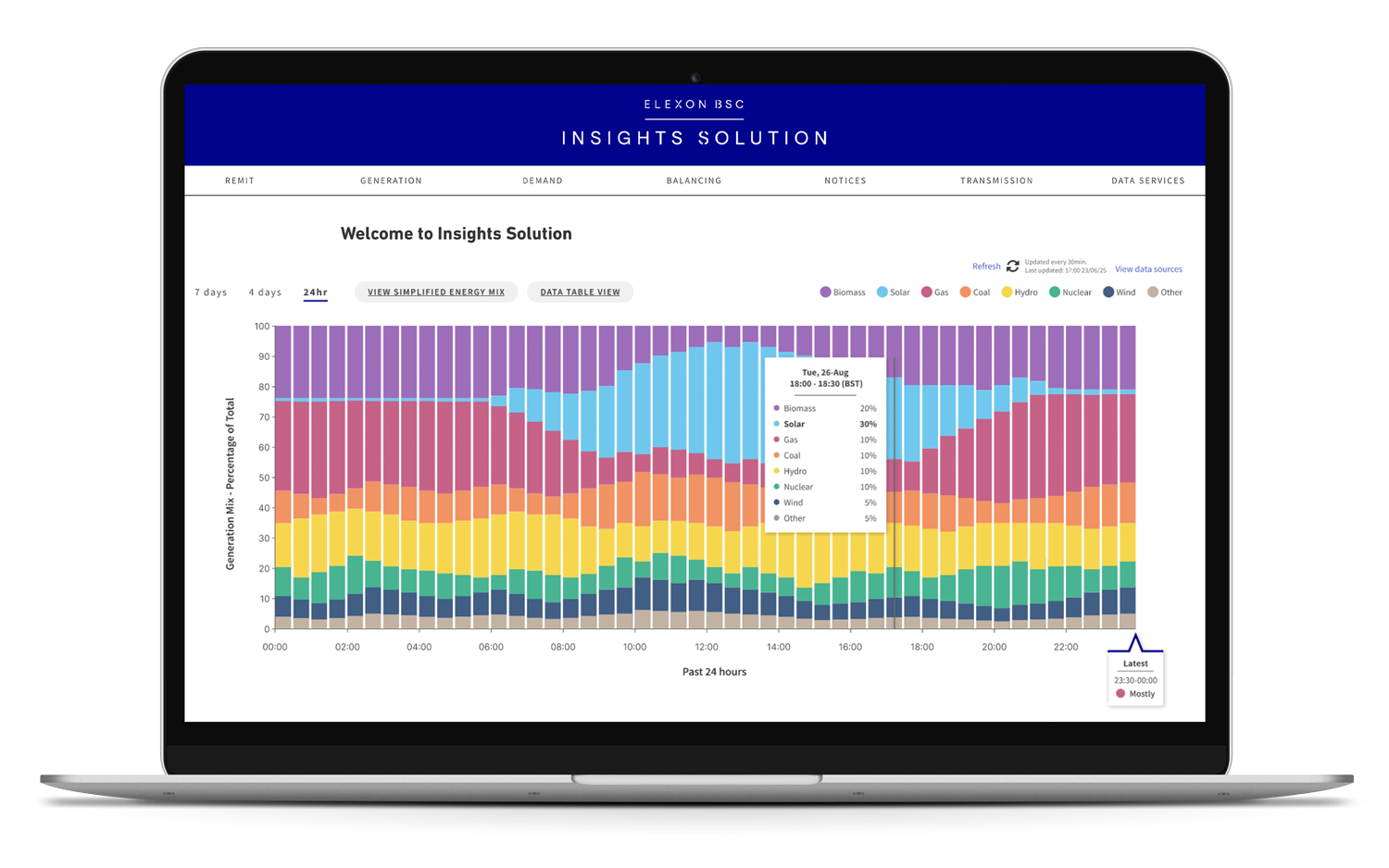
Transforming complex energy data into clear, actionable information
TEAM:
UX Designers x 2 · Design Principle · Developer Lead · Developers x 5
CLIENT:
Elexon (for Softwire)
TIME:
12 Weeks
MY ROLE:
UX Research · Product Strategy · Workshop Facilitation · Usability Testing · UI · Prototyping · Accessibility · Cross-functional Collaboration
At a glance
Elexon wanted to explore how its industry data could help everyday people make more informed, sustainable energy choices.
The challenge: make complex energy data understandable and useful without compromising accuracy, neutrality or trust.
The challenge
Elexon's data is designed for an industry audience. Our team needed to make it useful to people with little knowledge of the energy system.
Three competing needs
Complexity
Simplify technical data without distorting it.
Neutrality
Encourage informed choices without telling people what they should do.
Context
Provide enough explanation to build understanding without creating information overload.
The question
How might we make energy data clear and relevant enough for everyday people to use?
What we needed to learn
Before designing, we mapped our assumptions to identify the highest-risk unknowns.
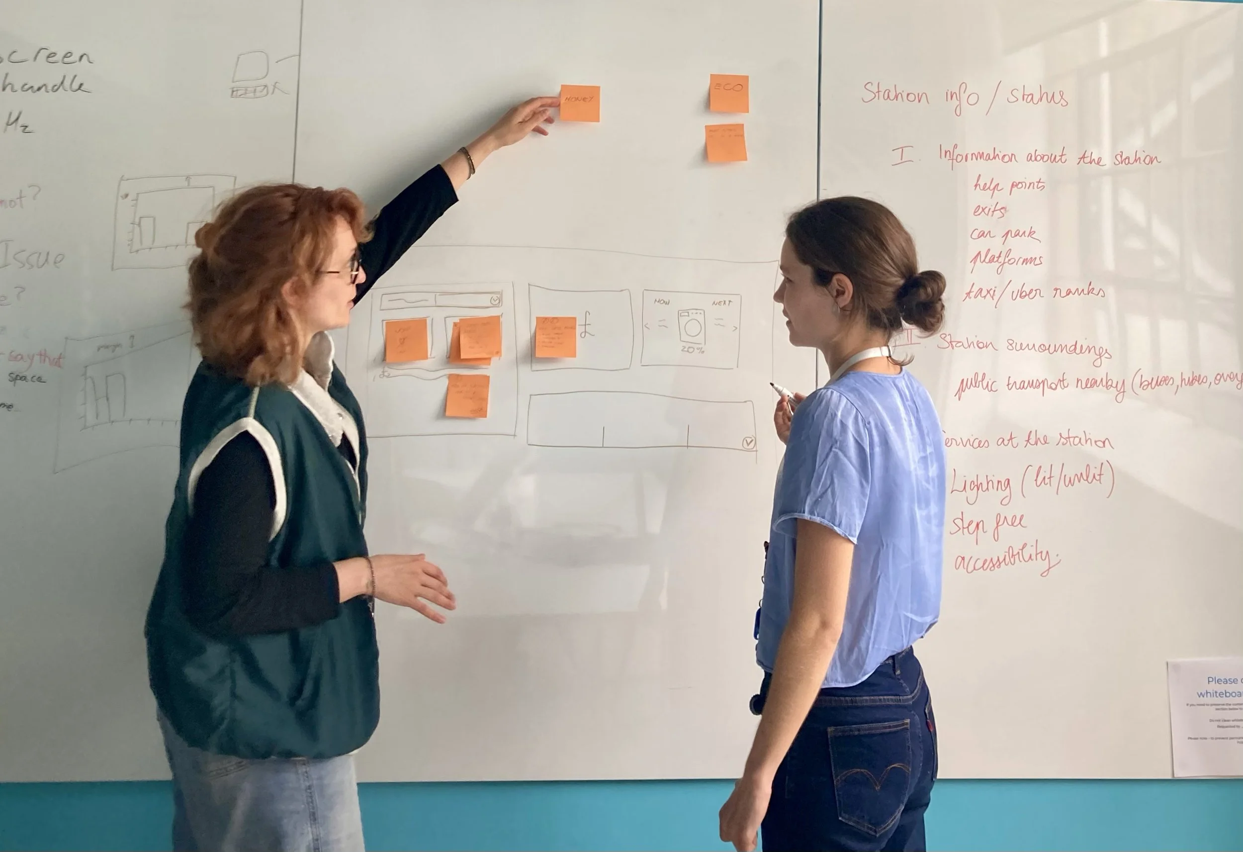
In collaboration with my co-designer Sophie, I shaped research around:
How people currently think about household energy
What motivates or prevents behaviour change
How they interpret unfamiliar data
What information would help them act
How much time and attention they are willing to give the experience
Research
Survey
responses
70
User
interviews
8
Stakeholder
interviews
3
Designed and ran the screener survey to understand the level of knowledge of energy data and recruit a demographically varied participant group.
Co-wrote the interview guide and led 4 of 8 interviews, exploring participants’ habits and attitudes toward energy data.
Co-wrote the discussion guides and led 2 of 3 meetings with product, strategy and marketing, refining scope and aligning priorities to balance user needs with business goals.
What research told us
Jointly, we synthesised the insights to reveal that energy use is rarely at the forefront of their mind. They needed the data to do more of the explaining for them.
The insights surfaced four distinct needs:
01. Clarity
People needed to understand information at a glance.
“I have all this data on Smart meter, but it’s so hard to sift through it”
03. Actionability
People wanted practical guidance rather than graphs they had to interpret themselves.
“I wish it just told me what to do, like a daily nudge I get from my fitness app”
02. Personal relevance
Comparisons and progress help people connect information to their own lives.
“I'd want information to be tailored to me so I could change my behaviour compared to my usage”
04. Convenience
Any behaviour change needed to fit around existing routines.
“I don't take action because I am busy day to day, I need convenience”
From dashboard to guided experience
Our first concepts still treated the product like a traditional data dashboard.
Informal testing quickly exposed the problem: people didn't know where to start.
That led to a key design decision:
Move away from a dashboard and guide users through the information progressively.
Ideas We Took Forward
01.
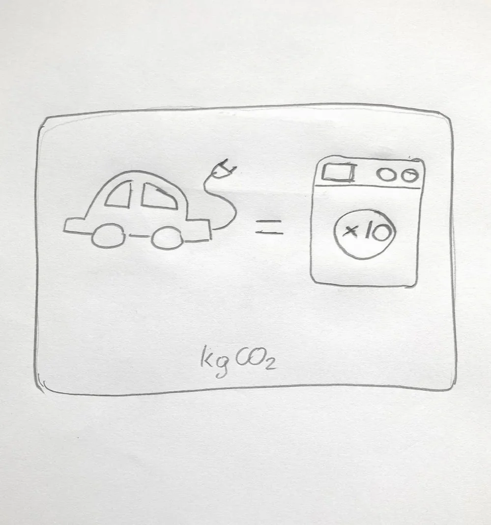
Make CO₂ relatable
Use real-world comparisons to help users understand environmental impact.
02.
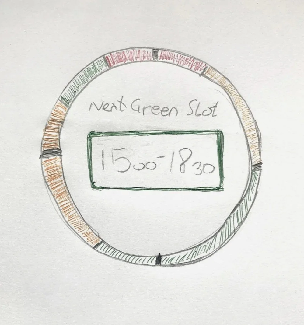
Show greener windows
Clearly show cleaner periods so users don't have to interpret the data themselves.
03.
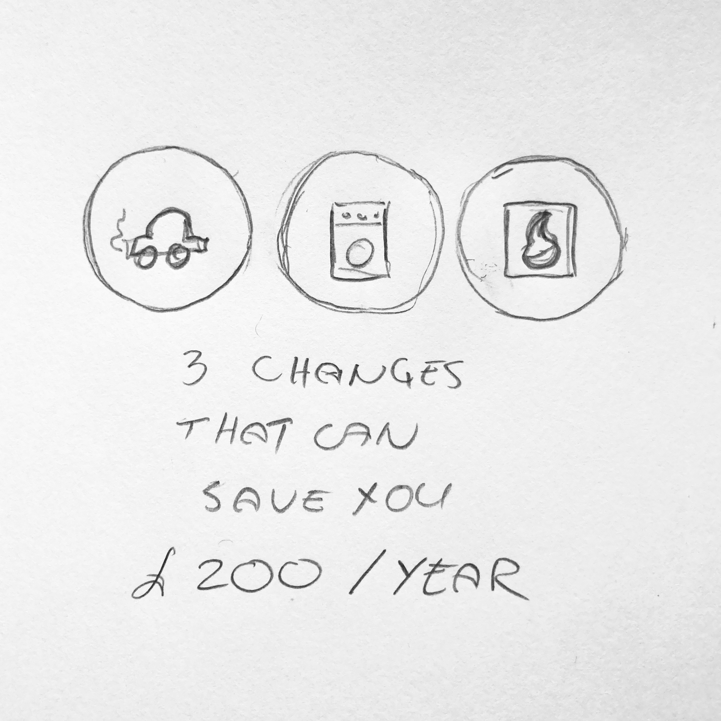
Show potential savings
Connect cleaner energy use with financial value for money-motivated users.