Elexon. Making complex energy data clear and actionable for everyday users.
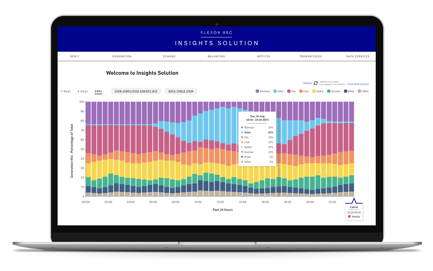
A proof of concept exploring how Elexon's industry-facing energy data could help people make more informed energy choices without compromising its accuracy or neutrality.
TEAM:
UX Designers x 2 · Design Principle · Developer Lead · Developers x 5
CLIENT:
Elexon (for Softwire)
TIME:
12 Weeks
MY ROLE:
UX Research · Problem Framing · Usability Testing · Product Strategy · Workshop Facilitation · Usability Testing · Accessibility · Cross-functional Collaboration
TL;DR
Elexon needed to turn technical, industry-facing energy data into something the everyday person could understand and act on - without losing accuracy or crossing into advice.
As one of two UX designers in a cross-functional team, I worked across the full arc of this project - from research and problem framing to content design and testing - building the stakeholder trust needed to move fast within an Agile process.
THE RESULT: A proof of concept demonstrating that Elexon's complex energy data could be made accessible to an entirely new audience while maintaining accuracy and neutrality.
Final Designs at a Glance
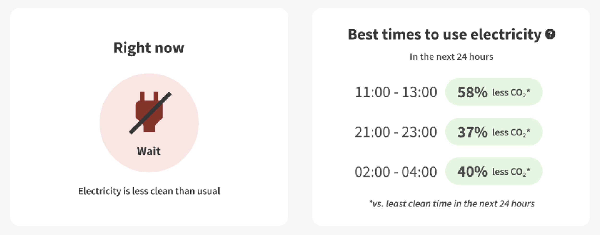
01. Take action now or wait
See at a glance when electricity is cleaner in the next 24 hours - without having to interpret complex data
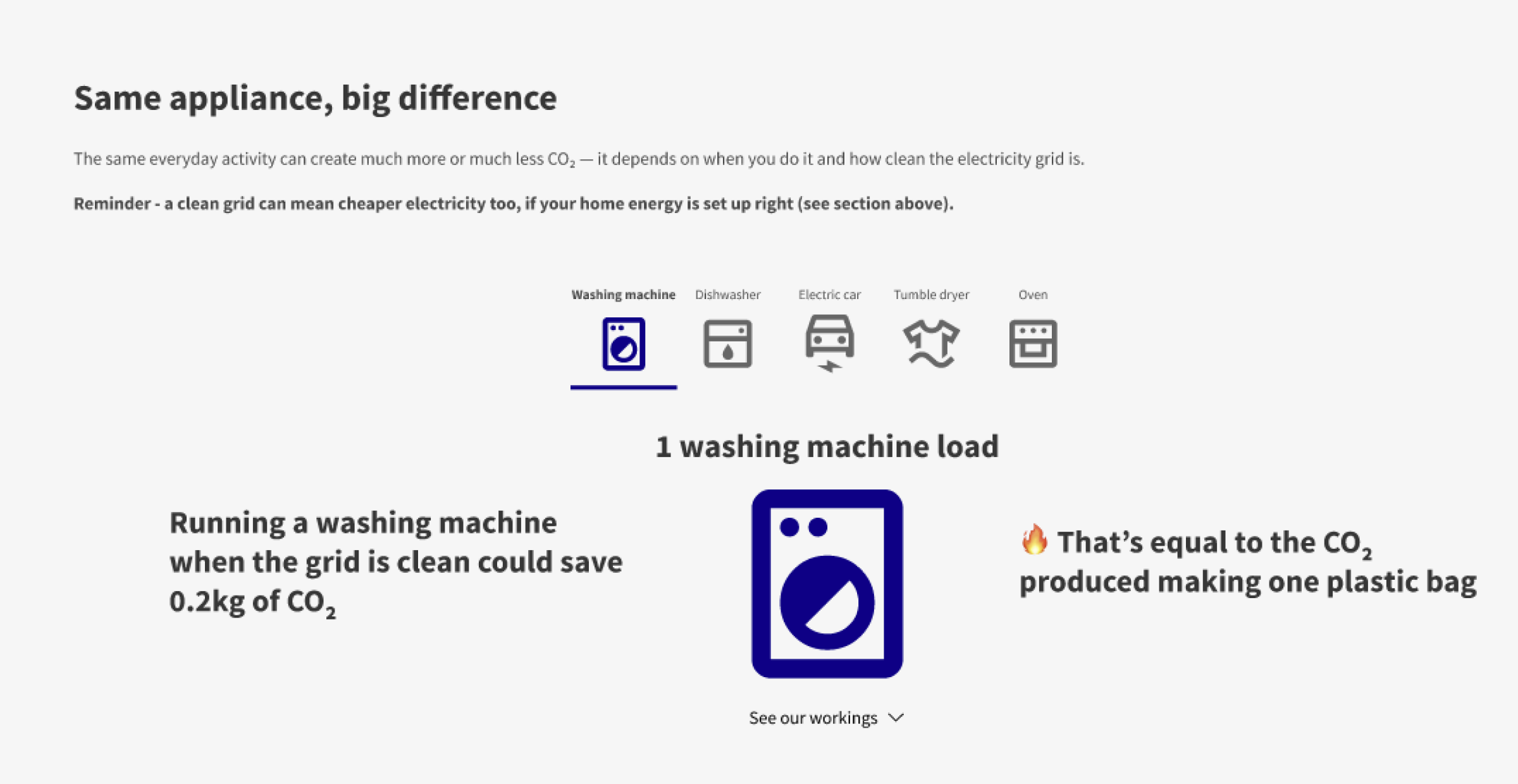
02. Understand the impact
Use relatable comparisons to understand the environmental impact of energy choices.
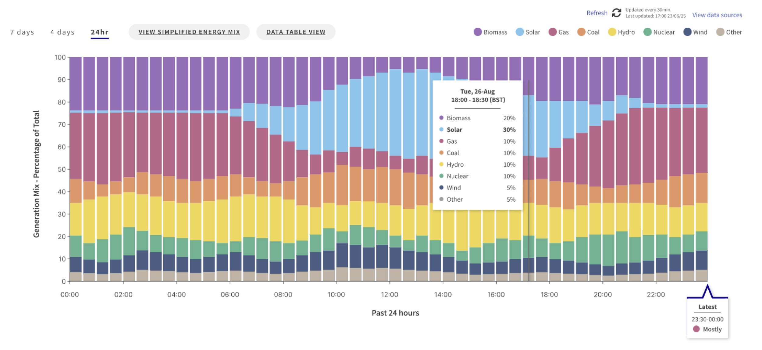
03. Explore the data
Use relatable comparisons to understand the environmental impact of energy choices.
“We’ve been really pleased with the quality of the content, backed by solid research. We cannot wait to put these ideas into production”- Elexon Stakeholder
The Challenge
Elexon's data was designed for industry experts. We needed to make it useful to people with little knowledge of the energy system.
Key considerations:
Simplify complexity
Make technical information understandable without distorting it.
Maintain neutrality
Help people make informed choices without giving advice.
Provide context
Give users enough explanation to understand the data without overwhelming them.
How might we make energy data clear and relevant enough for everyday people to use?
Finding the unknowns
Understanding the business context
We mapped our assumptions to identify the highest-risk unknowns and focus our research.
The assumption map shaped our discussion guide and three stakeholder meetings across product, strategy and marketing.
From these meetings, we distilled key priorities for Elexon:
Visibility
Greener decisions
Sustainability goals
Net Zero
Understanding the target user
We wanted to understand people's energy habits, knowledge and attitudes - and what might help them change behaviour.
Survey
responses
70
User
interviews
8
Stakeholder
interviews
3
Designed and ran the screener survey to understand the level of knowledge of energy data and recruit a demographically varied participant group.
Co-wrote the interview guide and led 4 of 8 interviews, exploring participants’ habits and attitudes toward energy data.
Co-wrote the discussion guides and led 2 of 3 meetings with product, strategy and marketing, refining scope and aligning priorities to balance user needs with business goals.
“I try to reduce my energy usage when I have the headspace for it”57% of respondents
Synthesising user insights
We synthesised the interviews using an affinity map, identifying recurring needs and barriers. These findings shaped our How Might We statement:
How Might We…
present relevant information to the everyday person that aligns with their motivations and reduces barriers to change, so that they feel able to adopt sustainable energy habits?
User Insights
The affinity map helped identify these common needs, which provided a clear, grounded focus for every design decision going forward.
Clarity at a glance
Information must be understandable without effort.
_______________________________
“I have all this data on Smart meter, but it’s so hard to sift through it”
Personal relevance
Progress tracking and comparisons increased motivation.
_______________________________
“I'd want information to be tailored to me so I could change my behaviour compared to my usage”
Actionability
Users wanted to be told what to do, not left to interpret graphs.
_______________________________
“I wish it just told me what to do, like a daily nudge I get from my fitness app”
Convenience
Behaviour change had to fit seamlessly into existing routines.
_______________________________
“I don't take action because I am busy day to day, I value convenience”
Two motivations,
one experience
Research showed that people were motivated by both financial and environmental benefits.
Helen,60
Eco-conscious
Motivation: Reduce environmental impact
Needs: Understand the impact of her choices
Barrier: Technical language and vague advice
“I feel responsible for what world I’ll leave for my kids, but the government needs to do more."
Kaylah, 32
Money-motivated
Motivation: Save money
Needs: Quick, practical decisions
Barrier: Technical data feels overwhelming
“I think you have to live your life, I cannot live according to a rigid schedule, or when I use the dishwasher”
48%
Helping the
environment
46%
Saving
money
Ideation
Defining the opportunity
The research revealed a clear insight:
Our users, Kaylah and Helen, didn’t need a deep dive into data; they needed clear explanations of CO₂ and green energy variation, along with practical tips they could apply in their daily lives.
This shifted our direction from a complex dashboard to a guided, narrative driven experience that:
01.
Research Showed:
Most users didn’t know when greener times were.
Design Solution:
Prioritise showing the best times to use appliances in plain language.
02.
Research Showed:
“Money-savers” and “eco-motivated” users needed different hooks.
Design Solution:
Design for both financial savings and carbon savings.
03.
Research Showed:
Behaviour change happens only when mental load is low.
Design Solution:
Create glanceable, lightweight interactions over complex deep dives.
Design Direction
Rapid ideation session
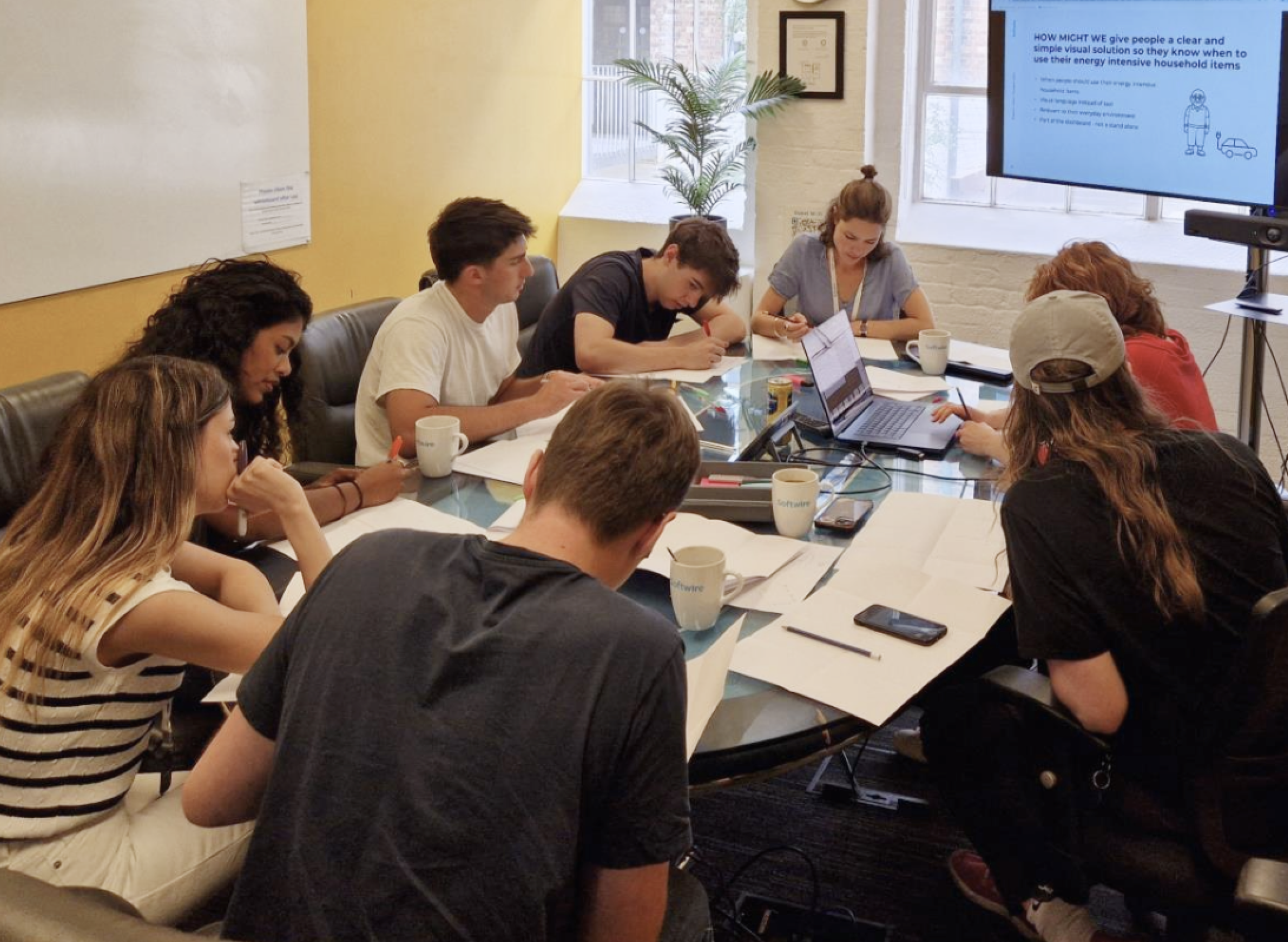
I led a rapid ideation session together with our 5 devs. This was a chance to bring fresh perspectives to the table and validate ideas.
HMW statements and a simplified proto-persona (“imagine your grandpa wants to charge his EV”) helped the team stay user-focused and design for a real person rather than personal assumptions.
How might we …
make energy data simple and clear so users know exactly what actions to take daily?
make energy data personal and relatable so users clearly see its impact on them?
Show users how energy choices influence their costs?
help users feel that they are improving the state of the environment?
Ideas We Pursued Further
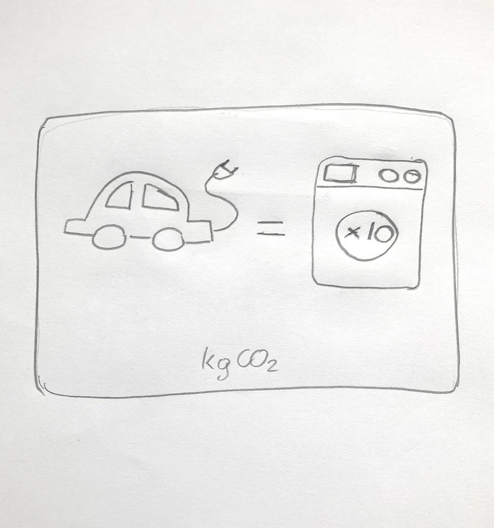
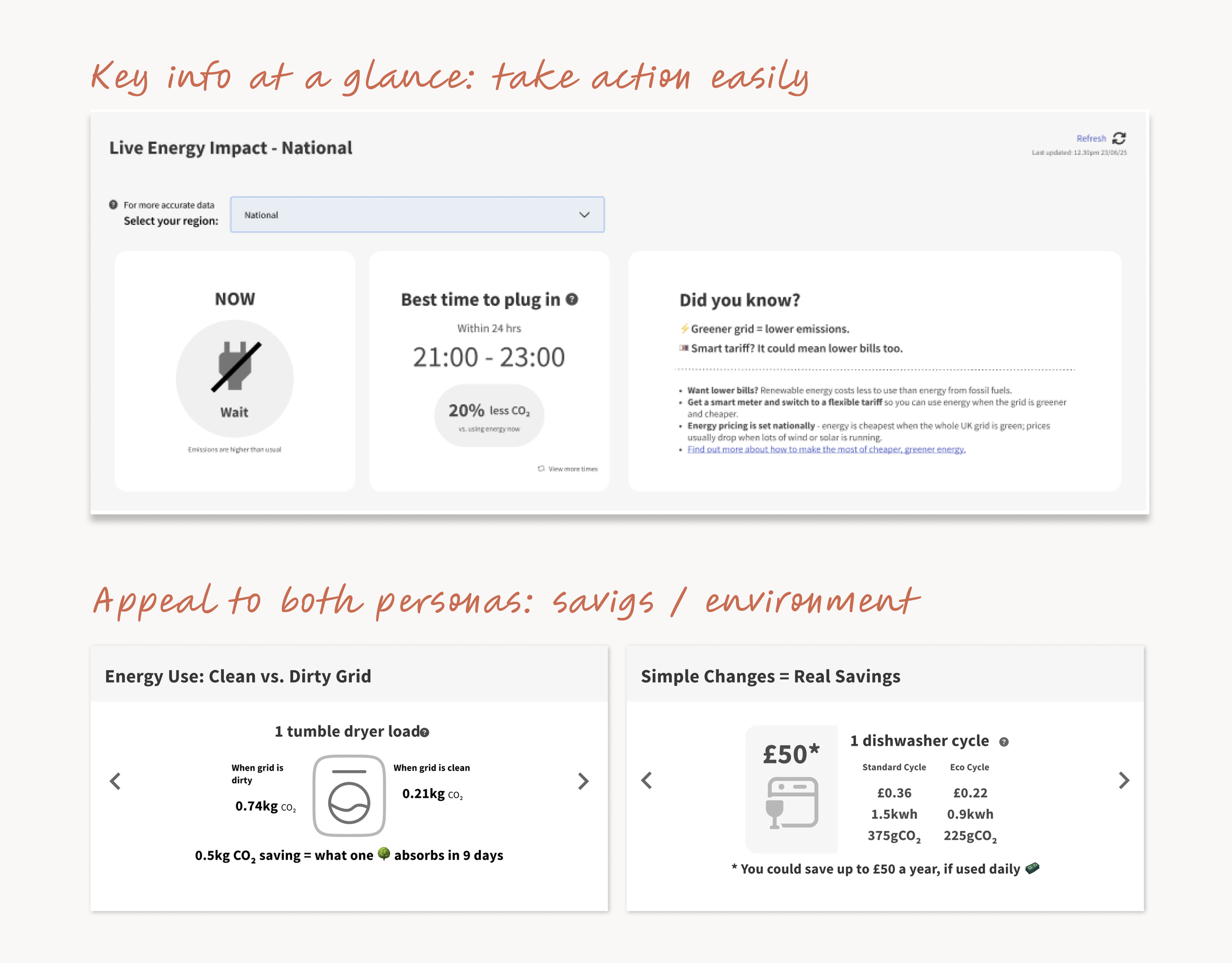
Use real-world comparisons to make CO₂ impact easy to grasp, helping users see how simple changes (like charging their EV during cleaner periods) can reduce emissions.
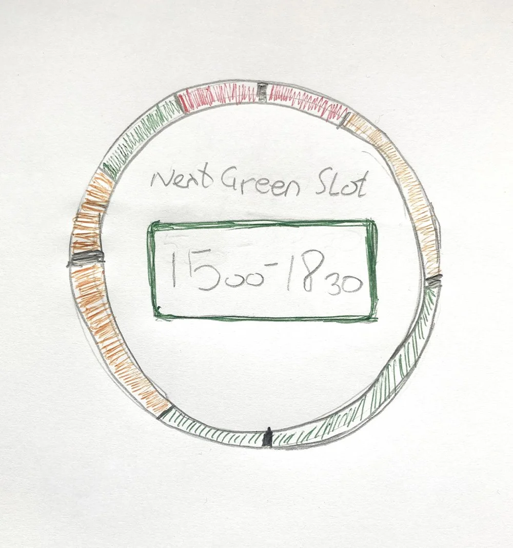
Show the next “green windows”, so users don’t have to interpret data, but can simply choose the best time to run energy-intensive activities.
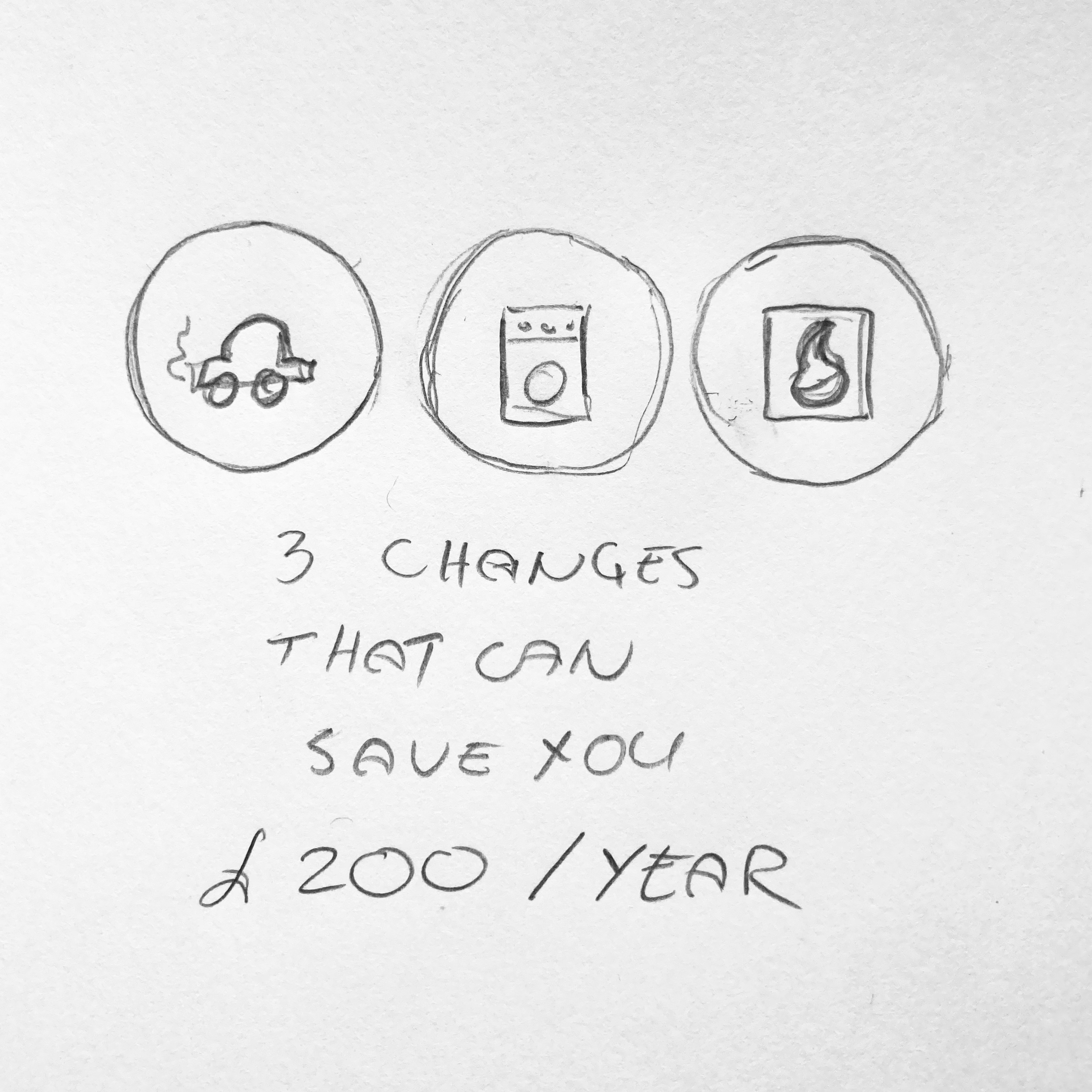
Show how choosing cleaner times or eco settings can add up to real savings over days, months or years to appeal to money-savvy users.
To create a design that could truly work, I regularly revisited Elexon’s business needs and constraints. Balancing user needs with Elexon’s organisational responsibilities and long-term goals was key to the project’s success.
This shaped how the team prioritised features and made thoughtful trade-offs along the way.
Keeping Business Constraints in Mind
Maintaining Elexon’s neutrality.
The design had to encourage action without persuading or taking a stance, remaining neutral while still motivating change.

Protecting Elexon’s data integrity.
We need to simplify complex data for users without distorting it or misleading users.

Constraints of a desktop-only design.
Research showed that everyday users typically check this information on their phones, making a desktop-only experience harder to reach them.

Embedding within Elexon’s industry-focused site.
This meant keeping everything to a single page. Thus limiting content and a risk that everyday users would get lost.

Finding What Holds Up
Rapid Concept Refinement
Close collaboration with developers helped us catch issues early and stay within technical constraints.
I proposed an early testing at this point to make sure we are going in the right direction.
Early Testing
We tested low-fi designs informally with colleagues in the office, which revealed that a dashboard format left too much confusion; testers didn’t know where to start.
We needed to rethink our approach.
Designing A Guided Experience
We made a decision to move away from a traditional dashboard and offer a more guided experience through the page that added layers of context and information.
Stepping into their shoes
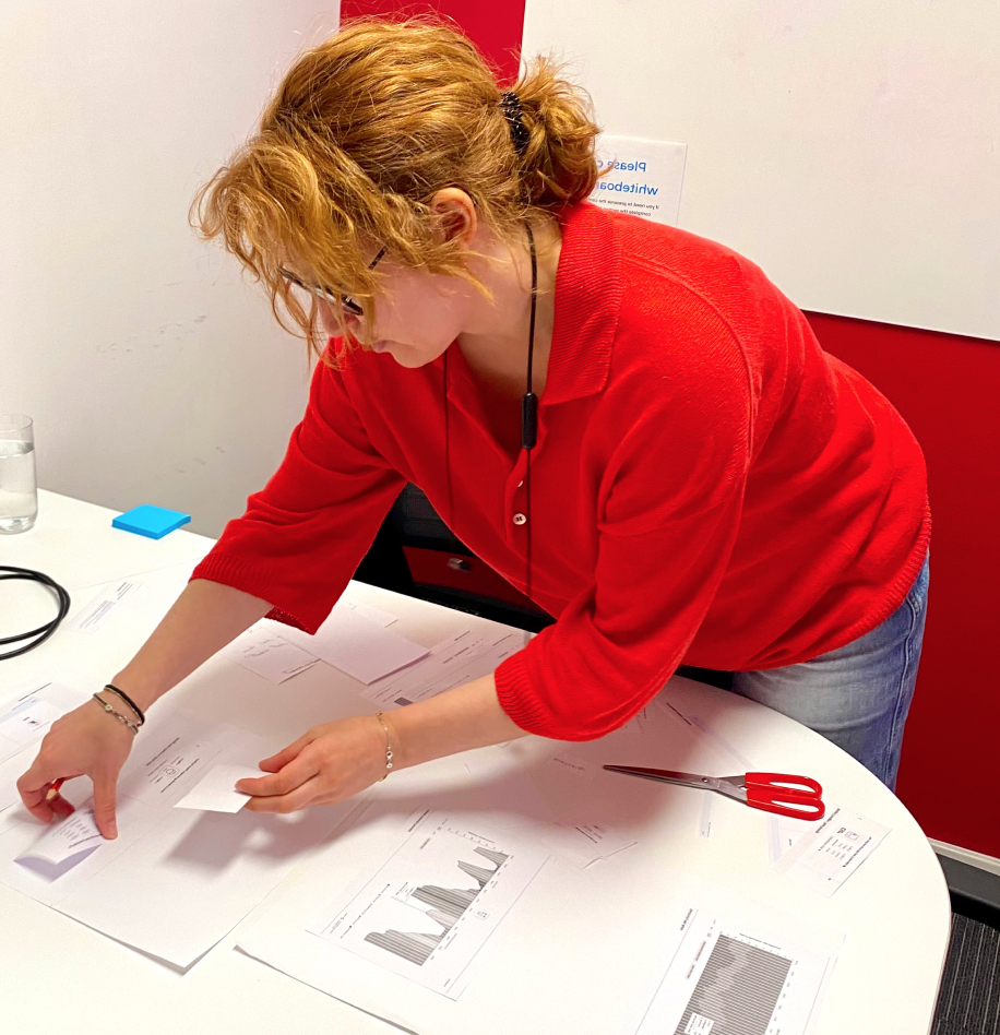
I proposed a hands-on method to work out the new structure (borrowed from my choreography work), printing and rearranging UI components like puzzle pieces to quickly visualise the user journey.
This exercise allowed my co-designer and me step into the users’ perspective and helped us create a clearer, more layered user flow.
With a strong personal interest in inclusive design, I advocated for accessibility checks. I tested the designs with a colour-blindness simulator, highlighted areas where visual cues needed strengthening and pushed for a data table that would be readable by screen readers.
Stakeholders responded positively and expressed interest in reviewing accessibility across their wider product.
Championing Accessibility
2 further rounds of usability testing (6 and 4 users respectively) showed that while users were engaged by the idea, they struggled with cognitive load, missing context and technical language, which affected trust and confidence.
Most improvements came from small, thoughtful changes, not dramatic redesign: adding more guiding through the page, reframing data, simplifying the language and bringing back just enough context to support understanding.
Iterations: Usability Testing
1. Cognitive Load is Too High
BEFORE
Testing revealed confusion with the appliance cards:
Users struggled to grasp the context at first glance
The bottom navigation was unexpected
"I am having to think hard about this and work it all out for myself" - Participant 3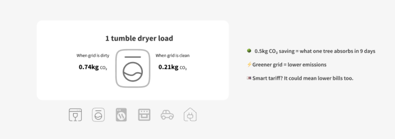
AFTER
• Added additional text to improve clarity and reduce frustration.
• Introduced a ‘see our workings’ dropdown to build credibility and trust.
• Internal A/B testing confirmed that our changes improved clarity.
2. Lack Of Context Left Testers Confused
"I am a little confused, am I looking at personal smart meter information or some general examples?" - Participant 5BEFORE
User testing showed that our early “simple” layouts were too stripped back, leaving people unsure what they were looking at.
AFTER
In response, we added clear guidance and layered context using expandable sections and hover states so users could get the detail they needed without being overwhelmed.
3. Language Still Felt Too Technical
"Emissions are high...  is that to do with my car?"
- Participant 3

"Carbon intensity forecast... what does that mean?"
- Participant 1
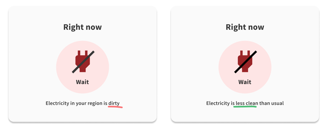
We overlooked that our personal knowledge grew during the project, and the terminology that made sense to us was too technical for the users, leaving them confused.
We simplified the wording further into clear, everyday language so it felt more accessible and easier to understand.

BEFORE
AFTER
Emissions are high
Electricity is less clean
Carbon Intensity forecast
When electricity is cleanest
Electricity delivered to your home
Energy Grid
We wanted to avoid motivating users through guilt, so we adjusted the tone to be more supportive and encouraging. This meant replacing judgmental language like “dirty” with more neutral phrasing such as “less clean.”
Outcomes

Built trust through transparency
Regional data, plain language, and visible data gaps helped users feel informed rather than misled.
Unlocked potential for a new audience
Demonstrated how industry data can be repackaged to support consumer engagement, sustainability storytelling, and future marketing visibility.
Made complex energy data understandable
Users with no prior knowledge could interpret emissions, regional trends, and timing at a glance.
Built trust through transparency
Regional data, plain language, and visible data gaps helped users feel informed rather than misled.
Measuring Success
User Understanding & Confidence
Use in-product surveys to measure how well users understand terms like “clean vs less clean,” what CO₂ means, and how confident they feel about changing their energy behaviour.

Behavior Change
Use follow-up interviews and short diary studies to track behaviour change, such as whether users wait for green windows or adjust their routines, to understand how the product fits into everyday life.

Engagement & Retention.
Evaluate engagement and retention by tracking time spent on the page, use of expandable explanations and tooltips, and repeat visits over time.
Final Designs

1.
Take action now or wait
If someone wants to charge their EV, they can quickly see whether their region is currently high-emission and decide whether to wait for a cleaner time. This allows for immediate decision-making without overwhelm.
2.
Understand the impact of the changes you make
Information about appliance-related emissions can empower people to adjust when they use their devices. Making the impact of CO2 emissions easy to understand is key in people relating to it and wanting to take action.
3.
Your energy setup can save money
Using cleaner energy can also lead to cost savings, showing how to do this can help motivate habit change. To maintain Elexon’s neutrality and trust, we focused on providing clear information users lacked, rather than directing them toward specific products or providers.
4.
The data behind the insights
To support different learning styles, the dashboard includes simplified graphs explaining UK CO₂ emissions and the energy mix, using plain language and clear colour coding. These visuals allow a deeper dive while showcasing Elexon’s data credibility.
Hey!
If you’re working through a problem or shaping something new, I’d love to talk.